
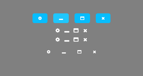
要搞点小软件,又不想使用图标和图标类库,突然想起FontAwesome,试了一下,还挺方便的,先弄了几个最常用的图标试一下,弄了几个按钮的样式,看一下效果:
看一下fontAwesome使用方法:
首先从官网下载字体,地址:http://www.fontawesome.com.cn/

下载后,把其中的 fontawesome-webfont.ttf 复制到软件目录,
添加一个几个资源字典:
Base.xaml :
<ResourceDictionary xmlns="http://schemas.microsoft.com/winfx/2006/xaml/presentation"
xmlns:x="http://schemas.microsoft.com/winfx/2006/xaml"
xmlns:sys="clr-namespace:System;assembly=mscorlib">
<ResourceDictionary.MergedDictionaries>
<ResourceDictionary Source="Colors.xaml"/>
</ResourceDictionary.MergedDictionaries>
<sys:Double x:Key="FontSizeMini" >12</sys:Double>
<sys:Double x:Key="FontSizeNormal" >14</sys:Double>
<sys:Double x:Key="FontSizeLarge" >16</sys:Double>
<FontFamily x:Key="FontAwesome">pack://application;,,,/Fonts/#FontAwesome</FontFamily>
<!--FontAwesome Icons Strings-->
<sys:String x:Key="SettingIcon"></sys:String>
<sys:String x:Key="MinsizeIcon"></sys:String>
<sys:String x:Key="MaxsizeIcon"></sys:String>
<sys:String x:Key="CloseIcon"></sys:String>
<Style x:Key="BaseStyle" TargetType="{x:Type Control}">
<Setter Property="FontFamily" Value="微软雅黑"/>
<Setter Property="FontSize" Value="{StaticResource FontSizeNormal}"/>
<Setter Property="BorderThickness" Value="0"/>
</Style>
<Style x:Key="IconButtonBaseStyle" TargetType="Button">
<Setter Property="FontFamily" Value="{StaticResource FontAwesome}"/>
<Setter Property="BorderThickness" Value="0"/>
</Style>
</ResourceDictionary>Colors.xaml
<ResourceDictionary xmlns="http://schemas.microsoft.com/winfx/2006/xaml/presentation"
                    xmlns:x="http://schemas.microsoft.com/winfx/2006/xaml">
    <Color x:Key="Black">#000000</Color>
    <SolidColorBrush x:Key="BlackBrush" Color="{StaticResource Black}"/>

    <Color x:Key="White">#FFFFFF</Color>
    <SolidColorBrush x:Key="WhiteBrush" Color="{StaticResource White}"/>

    <Color x:Key="TransWhite">#33dddddd</Color>
    <SolidColorBrush x:Key="TransWhiteBrush" Color="{StaticResource TransWhite}"/>

    <Color x:Key="Gray">#B8BABC</Color>
    <SolidColorBrush x:Key="GrayBrush" Color="{StaticResource Gray}"/>

    <Color x:Key="VeryDarkGray">#C0C0C0</Color>
    <SolidColorBrush x:Key="VeryDarkGrayBrush" Color="{StaticResource VeryDarkGray}"/>

    <Color x:Key="DarkGray">#C3C0C3</Color>
    <SolidColorBrush x:Key="DarkGrayBrush" Color="{StaticResource DarkGray}"/>

    <Color x:Key="LightGray">#ECECEC</Color>
    <SolidColorBrush x:Key="LightGrayBrush" Color="{StaticResource LightGray}"/>

    <Color x:Key="VeryLightGray">#F3F3F3</Color>
    <SolidColorBrush x:Key="VeryLightGrayBrush" Color="{StaticResource VeryLightGray}"/>


    <Color x:Key="ButtonBack">#07BDFD</Color>
    <SolidColorBrush x:Key="ButtonBackBrush" Color="{StaticResource ButtonBack}"/>

    <Color x:Key="ButtonHoverBack">#1FC7FD</Color>
    <SolidColorBrush x:Key="ButtonHoverBackBrush" Color="{StaticResource ButtonHoverBack}"/>
</ResourceDictionary>
ButtonStyles.xaml (重点)
<ResourceDictionary xmlns="http://schemas.microsoft.com/winfx/2006/xaml/presentation"
                    xmlns:x="http://schemas.microsoft.com/winfx/2006/xaml"
                    xmlns:local="clr-namespace:GQ">

    <ResourceDictionary.MergedDictionaries>
        <ResourceDictionary Source="Base.xaml"/>
    </ResourceDictionary.MergedDictionaries>

    <Style TargetType="{x:Type Button}" x:Key="IgnoreHover">
        <Setter Property="Background" Value="Transparent"/>
        <Setter Property="BorderThickness" Value="0"/>
        <Setter Property="Template">
            <Setter.Value>
                <ControlTemplate TargetType="{x:Type Button}">
                    <Border Padding="{TemplateBinding Padding}" Background="{TemplateBinding Background}">
                        <ContentPresenter VerticalAlignment="Center" HorizontalAlignment="Center"/>
                    </Border>
                </ControlTemplate>
            </Setter.Value>
        </Setter>
</Style>

    <Style TargetType="{x:Type Button}" BasedOn="{StaticResource BaseStyle}">
        <Setter Property="Background" Value="{StaticResource ButtonBackBrush}"/>
        <Setter Property="Foreground" Value="{StaticResource WhiteBrush}"/>
        <Setter Property="FocusVisualStyle" Value="{x:Null}"/>

        <Setter Property="Padding" Value="20 10"/>
        <Setter Property="Margin" Value="10"/>
        <Setter Property="Template">
            <Setter.Value>
                <ControlTemplate TargetType="{x:Type ButtonBase}">
                    <Border x:Name="border"
                            CornerRadius="6"
                            BorderBrush="{TemplateBinding BorderBrush}"
                            BorderThickness="{TemplateBinding BorderThickness}"
                            Background="{TemplateBinding Background}"
                            SnapsToDevicePixels="True">
                        <Grid>
                            <TextBlock Text="{TemplateBinding Content}"
                                   Focusable="False"
                                   FontFamily="{TemplateBinding FontFamily}"
                                   FontSize="{TemplateBinding FontSize}"
                                   HorizontalAlignment="{TemplateBinding HorizontalContentAlignment}"
                                   Margin="{TemplateBinding Padding}"
                                   SnapsToDevicePixels="{TemplateBinding SnapsToDevicePixels}"
                                   VerticalAlignment="{TemplateBinding VerticalContentAlignment}"/>
                        </Grid>
                    </Border>
                    <ControlTemplate.Triggers>
                        <EventTrigger RoutedEvent="MouseEnter">
                            <BeginStoryboard>
                                <Storyboard>
                                    <ColorAnimation To="{StaticResource ButtonHoverBack}" Duration="0:0:0.3" Storyboard.TargetName="border" Storyboard.TargetProperty="Background.Color"/>
                                </Storyboard>
                            </BeginStoryboard>
                        </EventTrigger>
                        <EventTrigger RoutedEvent="MouseLeave">
                            <BeginStoryboard>
                                <Storyboard>
                                    <ColorAnimation From="{StaticResource ButtonHoverBack}" Duration="0:0:0.3" Storyboard.TargetName="border" Storyboard.TargetProperty="Background.Color"/>
                                </Storyboard>
                            </BeginStoryboard>
                        </EventTrigger>
                        <Trigger Property="IsEnabled" Value="False">
                            <Setter Property="Background" TargetName="border" Value="{StaticResource VeryDarkGrayBrush}"/>
                        </Trigger>
                    </ControlTemplate.Triggers>
                </ControlTemplate>
            </Setter.Value>
        </Setter>
</Style>

    <Style x:Key="IconButton" TargetType="Button" BasedOn="{StaticResource IconButtonBaseStyle}">
        <Setter Property="Background" Value="Transparent"/>
        <Setter Property="Foreground" Value="{StaticResource WhiteBrush}"/>
        <Setter Property="Margin" Value="0"/>
        <Setter Property="Height" Value="32"/>
        <Setter Property="Padding" Value="5"/>
        <Setter Property="Width" Value="{Binding ActualHeight,RelativeSource={RelativeSource Self}}"/>
        <Setter Property="Template">
            <Setter.Value>
                <ControlTemplate TargetType="{x:Type ButtonBase}">
                    <Border x:Name="border"
                            BorderBrush="{TemplateBinding BorderBrush}"
                            BorderThickness="{TemplateBinding BorderThickness}"
                            Background="{TemplateBinding Background}"
                            SnapsToDevicePixels="True">
                        <Viewbox>
                            <TextBlock Text="{TemplateBinding Content}"
                                   Focusable="False"
                                   FontFamily="{TemplateBinding FontFamily}"
                                   HorizontalAlignment="{TemplateBinding HorizontalContentAlignment}"
                                   Margin="{TemplateBinding Padding}"
                                   FontSize="{TemplateBinding FontSize}"
                                   SnapsToDevicePixels="{TemplateBinding SnapsToDevicePixels}"
                                   VerticalAlignment="{TemplateBinding VerticalContentAlignment}"/>
                        </Viewbox>
                    </Border>
                    <ControlTemplate.Triggers>
                        <EventTrigger RoutedEvent="MouseEnter">
                            <BeginStoryboard>
                                <Storyboard>
                                    <ColorAnimation To="{StaticResource TransWhite}" Duration="0:0:0.2" Storyboard.TargetName="border" Storyboard.TargetProperty="Background.Color"/>
                                </Storyboard>
                            </BeginStoryboard>
                        </EventTrigger>
                        <EventTrigger RoutedEvent="MouseLeave">
                            <BeginStoryboard>
                                <Storyboard>
                                    <ColorAnimation From="{StaticResource TransWhite}" Duration="0:0:0.2" Storyboard.TargetName="border" Storyboard.TargetProperty="Background.Color"/>
                                </Storyboard>
                            </BeginStoryboard>
                        </EventTrigger>
                        <Trigger Property="IsEnabled" Value="False">
                            <Setter Property="Background" TargetName="border" Value="{StaticResource VeryDarkGrayBrush}"/>
                        </Trigger>
                    </ControlTemplate.Triggers>
                </ControlTemplate>
            </Setter.Value>
        </Setter>
</Style>

    <Style x:Key="IconGrowButton" TargetType="{x:Type Button}" BasedOn="{StaticResource IconButtonBaseStyle}">
        <Setter Property="Background" Value="Transparent"/>
        <Setter Property="Foreground" Value="{StaticResource WhiteBrush}"/>
        <Setter Property="Margin" Value="0"/>
        <Setter Property="Height" Value="32"/>
        <Setter Property="Padding" Value="5"/>
        <Setter Property="Width" Value="{Binding ActualHeight,RelativeSource={RelativeSource Self}}"/>
        <Setter Property="Template">
            <Setter.Value>
                <ControlTemplate TargetType="{x:Type ButtonBase}">
                    <Border x:Name="border"
                            BorderBrush="{TemplateBinding BorderBrush}"
                            BorderThickness="{TemplateBinding BorderThickness}"
                            Background="{TemplateBinding Background}"
                            SnapsToDevicePixels="True"
                            RenderTransformOrigin="0.5,0.5">
                        <Border.RenderTransform>
                            <ScaleTransform/>
                        </Border.RenderTransform>
                        <Viewbox>
                            <TextBlock Text="{TemplateBinding Content}"
                                   Focusable="False"
                                   FontFamily="{TemplateBinding FontFamily}"
                                   HorizontalAlignment="{TemplateBinding HorizontalContentAlignment}"
                                   Margin="{TemplateBinding Padding}"
                                   FontSize="{TemplateBinding FontSize}"
                                   SnapsToDevicePixels="{TemplateBinding SnapsToDevicePixels}"
                                   VerticalAlignment="{TemplateBinding VerticalContentAlignment}"/>
                        </Viewbox>
                    </Border>
                    <ControlTemplate.Triggers>
                        <EventTrigger RoutedEvent="MouseEnter">
                            <BeginStoryboard>
                                <Storyboard>
                                    <DoubleAnimation To="1.3" Duration="0:0:0.2" Storyboard.TargetName="border" Storyboard.TargetProperty="(RenderTransform).(ScaleTransform.ScaleX)"/>
                                    <DoubleAnimation To="1.3" Duration="0:0:0.2" Storyboard.TargetName="border" Storyboard.TargetProperty="(RenderTransform).(ScaleTransform.ScaleY)"/>
                                </Storyboard>
                            </BeginStoryboard>
                        </EventTrigger>
                        <EventTrigger RoutedEvent="MouseLeave">
                            <BeginStoryboard>
                                <Storyboard>
                                    <DoubleAnimation To="1" Duration="0:0:0.2" Storyboard.TargetName="border" Storyboard.TargetProperty="(RenderTransform).(ScaleTransform.ScaleX)"/>
                                    <DoubleAnimation To="1" Duration="0:0:0.2" Storyboard.TargetName="border" Storyboard.TargetProperty="(RenderTransform).(ScaleTransform.ScaleY)"/>
                                </Storyboard>
                            </BeginStoryboard>
                        </EventTrigger>
                        <Trigger Property="IsEnabled" Value="False">
                            <Setter Property="Background" TargetName="border" Value="{StaticResource VeryDarkGrayBrush}"/>
                        </Trigger>
                    </ControlTemplate.Triggers>
                </ControlTemplate>
            </Setter.Value>
        </Setter>
</Style>

    <Style x:Key="TextButton" TargetType="{x:Type Button}" BasedOn="{StaticResource BaseStyle}">
        <Setter Property="Background" Value="Transparent"/>
        <Setter Property="Foreground" Value="{StaticResource WhiteBrush}"/>
        <Setter Property="BorderThickness" Value="0"/>
        <Setter Property="Padding" Value="20 10"/>
        <Setter Property="Margin" Value="0 10"/>
        <Setter Property="Template">
            <Setter.Value>
                <ControlTemplate TargetType="{x:Type ButtonBase}">
                    <Border x:Name="border"
                            CornerRadius="6"
                            BorderBrush="{TemplateBinding BorderBrush}"
                            BorderThickness="{TemplateBinding BorderThickness}"
                            Background="{TemplateBinding Background}"
                            SnapsToDevicePixels="True">
                        <TextBlock Text="{TemplateBinding Content}"
                                   Focusable="False"
                                   FontFamily="{TemplateBinding FontFamily}"
                                   FontSize="{TemplateBinding FontSize}"
                                   HorizontalAlignment="{TemplateBinding HorizontalContentAlignment}"
                                   Margin="{TemplateBinding Padding}"
                                   SnapsToDevicePixels="{TemplateBinding SnapsToDevicePixels}"
                                   VerticalAlignment="{TemplateBinding VerticalContentAlignment}"/>
                    </Border>
                    <ControlTemplate.Triggers>
                        <Trigger Property="IsMouseOver" Value="True">
                            <Setter Property="Foreground" Value="{StaticResource DarkGrayBrush}"/>
                        </Trigger>
                        <Trigger Property="IsEnabled" Value="False">
                            <Setter Property="Foreground" Value="{StaticResource VeryDarkGrayBrush}"/>
                        </Trigger>
                    </ControlTemplate.Triggers>
                </ControlTemplate>
            </Setter.Value>
        </Setter>
</Style>
    <!--上述5个样式 参考自 https://www.youtube.com/playlist?list=PLrW43fNmjaQVYF4zgsD0oL9Iv6u23PI6M
        有改动,不完全一样,你可以根据需要自行修改-->
</ResourceDictionary>
然后在App.xaml内添加所有资源字典:
<Application x:Class="GQ.App"
             xmlns="http://schemas.microsoft.com/winfx/2006/xaml/presentation"
             xmlns:x="http://schemas.microsoft.com/winfx/2006/xaml"
             xmlns:local="clr-namespace:GQ"
             StartupUri="/Windows/LoginWindow.xaml"
             xmlns:sys="clr-namespace:System;assembly=mscorlib"
             xmlns:arr="clr-namespace:System.Collections.Generic;assembly=mscorlib">
    <Application.Resources>
        <ResourceDictionary>
            <ResourceDictionary.MergedDictionaries>
                <ResourceDictionary Source="/Styles/Base.xaml"/>
                <ResourceDictionary Source="/Styles/Panel3DStyle.xaml"/>
                <ResourceDictionary Source="/Styles/ButtonStyles.xaml"/>
            </ResourceDictionary.MergedDictionaries>

        </ResourceDictionary>
    </Application.Resources>
</Application>
最后,创建一个LoginWindow.xaml,测试这几个样式,并使用FontAwesome:
<Window x:Class="GQ.LoginWindow"
        xmlns="http://schemas.microsoft.com/winfx/2006/xaml/presentation"
        xmlns:x="http://schemas.microsoft.com/winfx/2006/xaml"
        xmlns:d="http://schemas.microsoft.com/expression/blend/2008"
        xmlns:mc="http://schemas.openxmlformats.org/markup-compatibility/2006"
        xmlns:local="clr-namespace:GQ"
        mc:Ignorable="d"
        AllowsTransparency="True"
        WindowStyle="None"
        Background="Gray"
        WindowStartupLocation="CenterScreen"
        Title="MainWindow" Height="470" Width="497">

    <Grid>
        <StackPanel HorizontalAlignment="Center" VerticalAlignment="Center">
            <StackPanel Orientation="Horizontal" HorizontalAlignment="Center">
                <Button FontFamily="{StaticResource FontAwesome}" Content="{StaticResource SettingIcon}"/>
                <Button FontFamily="{StaticResource FontAwesome}" Content="{StaticResource MinsizeIcon}"/>
                <Button FontFamily="{StaticResource FontAwesome}" Content="{StaticResource MaxsizeIcon}"/>
                <Button FontFamily="{StaticResource FontAwesome}" Content="{StaticResource CloseIcon}"/>
            </StackPanel>
            <StackPanel Orientation="Horizontal" HorizontalAlignment="Center">
                <Button Style="{StaticResource IconGrowButton}"  Content="{StaticResource SettingIcon}"/>
                <Button Style="{StaticResource IconGrowButton}"  Content="{StaticResource MinsizeIcon}"/>
                <Button Style="{StaticResource IconGrowButton}"  Content="{StaticResource MaxsizeIcon}"/>
                <Button Style="{StaticResource IconGrowButton}" Content="{StaticResource CloseIcon}"/>
            </StackPanel>
            <StackPanel Orientation="Horizontal" HorizontalAlignment="Center">
                <Button Style="{StaticResource IconButton}"  Content="{StaticResource SettingIcon}"/>
                <Button Style="{StaticResource IconButton}"  Content="{StaticResource MinsizeIcon}"/>
                <Button Style="{StaticResource IconButton}"  Content="{StaticResource MaxsizeIcon}"/>
                <Button Style="{StaticResource IconButton}" Content="{StaticResource CloseIcon}"/>
            </StackPanel>
            <StackPanel Orientation="Horizontal" HorizontalAlignment="Center">
                <Button Style="{StaticResource TextButton}" FontFamily="{StaticResource FontAwesome}" Content="{StaticResource SettingIcon}"/>
                <Button Style="{StaticResource TextButton}" FontFamily="{StaticResource FontAwesome}" Content="{StaticResource MinsizeIcon}"/>
                <Button Style="{StaticResource TextButton}" FontFamily="{StaticResource FontAwesome}" Content="{StaticResource MaxsizeIcon}"/>
                <Button Style="{StaticResource TextButton}" FontFamily="{StaticResource FontAwesome}" Content="{StaticResource CloseIcon}"/>
            </StackPanel>
        </StackPanel>
    </Grid>
</Window>
这样控件就能使用完成了,虽然看起来很麻烦,但收益还是不小的,以后再添加别的图标,就很方便了。
当然喽,做正经的软件,图标肯定是由设计给的,不是用这些网上的这些图标,只能自己玩玩,嘿嘿
© 版权声明
文章版权归作者所有,未经允许请勿转载。
THE END


暂无评论内容