有小伙伴对我说,想看轮播图控件
Get~
面就直接看代码吧。毕竟大家都是为了代码来的。。。
创建Carouse类,全部代码如下,注释都写在代码中间,你一定能看懂:
using System;
using System.Collections.Generic;
using System.Collections.ObjectModel;
using System.ComponentModel;
using System.Windows;
using System.Windows.Controls;
using System.Windows.Markup;
using System.Windows.Media.Animation;
using System.Windows.Threading;

namespace WpfDemo
{
    [DefaultProperty("Items")]
    [ContentProperty("Items")]
    [TemplatePart(Name = ItemHostPanel, Type = typeof(Panel))]
    public class Carouse : ContentControl
    {
        private const string ItemHostPanel = "PART_ItemHost";//约定图片控件的窗口x:Name
        private const string PreButton = "PART_PreButton";//约定上一张按钮的x:Name
        private const string NextButton = "PART_NextButton";//约定下一张按钮的x:Name
        private List<double> _widthList = new List<double>();//记录每个图片到容器左侧的距离
        private DispatcherTimer _updateTimer;//自动切换图片的定时器
        public Panel ItemHost { get; set; }//图片容器控件
        private Button _preButton { get; set; }//上一张按钮
        private Button _nextButton { get; set; }//下一张按钮

        [DesignerSerializationVisibility(DesignerSerializationVisibility.Content)]
        [Bindable(true)]
        public ObservableCollection<object> Items { get; set; } = new ObservableCollection<object>();//在xaml里面添加图片后,会自动添加到这个集合里面
        private int _currentIndex = 0;//当前是第几张图片
        public int CurrentIndex
        {
            get
            {
                _currentIndex = Math.Max(0, _currentIndex);
                _currentIndex = Math.Min(Items.Count - 1, _currentIndex);
                return _currentIndex;
            }
            set
            {
                if (value == _currentIndex) return;
                if (value < 0) _currentIndex = Items.Count - 1;
                else if (value >= Items.Count) _currentIndex = 0;
                else _currentIndex = value;
                UpdateWidths();//更新_widthList
                UpdateMargin();//执行动画更新当前显示的图片
            }
        }
        //自动切换图片的时间间隔
        public TimeSpan Interval
        {
            get { return (TimeSpan)GetValue(IntervalProperty); }
            set { SetValue(IntervalProperty, value); }
        }
        public static readonly DependencyProperty IntervalProperty =
            DependencyProperty.Register("Interval", typeof(TimeSpan), typeof(Carouse), new PropertyMetadata(TimeSpan.FromSeconds(4)));

        //是否自动切换图片
        public bool AutoChange
        {
            get { return (bool)GetValue(AutoChangeProperty); }
            set { SetValue(AutoChangeProperty, value); }
        }
        public static readonly DependencyProperty AutoChangeProperty =
            DependencyProperty.Register("AutoChange", typeof(bool), typeof(Carouse), new PropertyMetadata(false, (o, args) =>
            {
                var ctl = (Carouse)o;
                ctl.SetTimer((bool)args.NewValue);
            }));


        private int _animationDelay = 1000;
        //每次动画执行时长
        public int AnimationDelay
        {
            get { return _animationDelay; }
            set { _animationDelay = value; }
        }
        //设置自动切换图片的定时器
        public void SetTimer(bool isOpen)
        {
            if (_updateTimer != null)
            {
                _updateTimer.Tick -= UpdateTimer_Tick;
                _updateTimer.Stop();
                _updateTimer = null;
            }
            if (!isOpen) return;
            _updateTimer = new DispatcherTimer()
            {
                Interval = Interval
            };
            _updateTimer.Tick += UpdateTimer_Tick;
            _updateTimer.Start();
        }
        private void UpdateTimer_Tick(object sender, EventArgs e)
        {
            if (IsMouseOver) return;
            CurrentIndex++;
        }
        private void UpdateWidths()
        {
            _widthList.Clear();
            _widthList.Add(0); var width = .0;
            foreach (FrameworkElement item in ItemHost.Children)
            {
                item.Measure(new Size(ActualWidth, ActualHeight));
                width += item.DesiredSize.Width;
                _widthList.Add(width);
            }
        }
        //执行动画
        public void UpdateMargin()
        {
            if (ItemHost == null) return;
            if (ItemHost.Children.Count == 0) return;
            var marginAnimation = new ThicknessAnimation(new Thickness(-_widthList[CurrentIndex], 0, 0, 0),
                new Duration(TimeSpan.FromMilliseconds(AnimationDelay)))
            {
                EasingFunction = new PowerEase { EasingMode = EasingMode.EaseOut }
            };
            ItemHost.BeginAnimation(MarginProperty, marginAnimation);
        }
        //初始化控件,添加按钮点击事件
        public override void OnApplyTemplate()
        {
            ItemHost?.Children.Clear();
            base.OnApplyTemplate();
            ItemHost = GetTemplateChild(ItemHostPanel) as Panel;
            _preButton = GetTemplateChild(PreButton) as Button;
            if (_preButton != null)
            {
                _preButton.Click -= Pre;
                _preButton.Click += Pre;
            }
            _nextButton = GetTemplateChild(NextButton) as Button;
            if (_nextButton != null)
            {
                _nextButton.Click -= Next;
                _nextButton.Click += Next;
            }
            RefreshItems();//将每个图片添加到容器中
        }
        private void Pre(object sender, RoutedEventArgs e) => CurrentIndex--;
        private void Next(object sender, RoutedEventArgs e) => CurrentIndex++;
        private void RefreshItems()
        {
            if (ItemHost == null) return;
            ItemHost.Children.Clear();
            if (Items.Count == 0) return;
            foreach (var item in Items)
            {
                if (item is UIElement element)
                    ItemHost.Children.Add(element);
            }
        }
    }
}
创建一个窗口,使用上面这个自定义轮播图控件:
<Window x:Class="WpfDemo.MainWindow"
        xmlns="http://schemas.microsoft.com/winfx/2006/xaml/presentation"
        xmlns:x="http://schemas.microsoft.com/winfx/2006/xaml"
        xmlns:d="http://schemas.microsoft.com/expression/blend/2008"
        xmlns:mc="http://schemas.openxmlformats.org/markup-compatibility/2006"
        xmlns:local="clr-namespace:WpfDemo"
        mc:Ignorable="d"
        x:Name="window"
        Title="轮播图控件Demo"
        Margin="0" Padding="0"
        Height="600" Width="800">
    <Grid Background="LightBlue">
        <Grid Width="650" Height="400" Background="Gray">
            <local:Carouse AutoChange="True" x:Name="car">
                <Grid Width="650" Height="{Binding Height,ElementName=car}">
                    <TextBlock Text="欢迎关注 WPF UI" VerticalAlignment="Center" HorizontalAlignment="Center" FontFamily="微软雅黑" Foreground="LightBlue" FontSize="40"/>
                    <Grid.Background>
                        <LinearGradientBrush>
                            <LinearGradientBrush.GradientStops>
                                <GradientStop Offset="0" Color="Red"/>
                                <GradientStop Offset="0.5" Color="Green"/>
                                <GradientStop Offset="1" Color="Blue"/>
                            </LinearGradientBrush.GradientStops>
                        </LinearGradientBrush>
                    </Grid.Background>
                </Grid>
                <Image Width="650" Source="D:\\bizhi\\清纯\\1-9.jpg" Stretch="UniformToFill"/>
                <Image Width="650" Source="D:\\bizhi\\清纯\\1-1.jpg" Stretch="UniformToFill"/>
                <Image Width="650" Source="D:\\bizhi\\清纯\\2-2.jpg" Stretch="UniformToFill"/>
                <Image Width="650" Source="D:\\bizhi\\清纯\\2-5.jpg" Stretch="UniformToFill"/>
            </local:Carouse>
        </Grid>
    </Grid>
</Window>
从xaml代码可以看出,不一定是图片可以,只要是ContentControl都可以当作一个图片添加到里面,这就比较好玩了。
在App.xaml时添加控件样式 :
<Application x:Class="WpfDemo.App"
             xmlns="http://schemas.microsoft.com/winfx/2006/xaml/presentation"
             xmlns:x="http://schemas.microsoft.com/winfx/2006/xaml"
             xmlns:local="clr-namespace:WpfDemo"
             StartupUri="MainWindow.xaml">
    <Application.Resources>
        <Style TargetType="Button" x:Key="LeftButton">
            <Setter Property="Cursor" Value="Hand"/>
            <Setter Property="Template">
                <Setter.Value>
                    <ControlTemplate>
                        <Border x:Name="border" Background="#66000000" Width="50" Height="80" CornerRadius="5">
                            <Image Width="32" Height="32" Source="/left.png" HorizontalAlignment="Center" VerticalAlignment="Center"/>
                        </Border>
                        <ControlTemplate.Triggers>
                            <Trigger Property="IsMouseOver" Value="True">
                                <Setter Property="Background" Value="#77000000" TargetName="border"/>
                            </Trigger>
                        </ControlTemplate.Triggers>
                    </ControlTemplate>
                </Setter.Value>
            </Setter>
</Style>
        <Style TargetType="Button" x:Key="RightButton">
            <Setter Property="Cursor" Value="Hand"/>
            <Setter Property="Template">
                <Setter.Value>
                    <ControlTemplate>
                        <Border x:Name="border" Background="#66000000" Width="50" Height="80"  CornerRadius="5">
                            <Image Width="32" Height="32" Source="/right.png" HorizontalAlignment="Center" VerticalAlignment="Center"/>
                        </Border>
                        <ControlTemplate.Triggers>
                            <Trigger Property="IsMouseOver" Value="True">
                                <Setter Property="Background" Value="#77000000" TargetName="border"/>
                            </Trigger>
                        </ControlTemplate.Triggers>
                    </ControlTemplate>
                </Setter.Value>
            </Setter>
</Style>
        <Style TargetType="local:Carouse">
            <Setter Property="ClipToBounds" Value="True"/>
            <Setter Property="Template">
                <Setter.Value>
                    <ControlTemplate TargetType="local:Carouse">
                        <Grid>
                            <StackPanel x:Name="PART_ItemHost"  Orientation="Horizontal"/>
                            <Grid x:Name="ButtonGrid">
                                <Button x:Name="PART_PreButton" HorizontalAlignment="Left" VerticalAlignment="Center" Margin="20 0 0 0" Style="{StaticResource LeftButton}"/>
                                <Button x:Name="PART_NextButton" HorizontalAlignment="Right" VerticalAlignment="Center" Margin="0 0 20 0" Style="{StaticResource RightButton}"/>
                            </Grid>
                        </Grid>
                    </ControlTemplate>
                </Setter.Value>
            </Setter>
</Style>
    </Application.Resources>
</Application>
主要定义了两个按钮样式 ,和轮播图控件的样式。
用到的资源图片有两个:
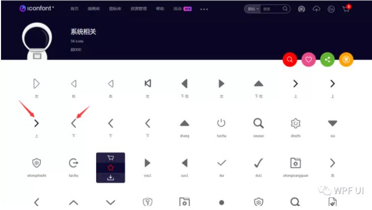
在IconFont网站 上搜索左右,下载32px白色图片即可
遗憾的是,控件大小动态改变,Items动态修改的逻辑比较复杂,今天还没有做好。后面再看看吧,如果我能做出来,再发一篇文章讲一下。。。
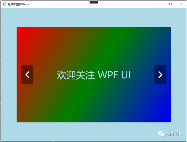
效果图如下:
© 版权声明
文章版权归作者所有,未经允许请勿转载。
THE END


暂无评论内容