最近写代码,界面上有个进度条,想整好看,也没什么比较好的建议,粗糙的弄了两个,够用了。。
下面就直接看看样式吧:
第一个样式:
<Style x:Key="pro1" TargetType="{x:Type ProgressBar}">
            <Setter Property="Height" Value="15"/>
            <Setter Property="Background" Value="#F9F9F9"/>
            <Setter Property="Padding" Value="5,2"/>
            <Setter Property="Template">
                <Setter.Value>
                    <ControlTemplate TargetType="{x:Type ProgressBar}">
                        <Border Padding="0" CornerRadius="4" Background="{TemplateBinding Background}">
                            <Grid Height="{TemplateBinding Height}">
                                <Border x:Name="PART_Track"/>
                                <Grid  x:Name="PART_Indicator" Background="Transparent"
                                       HorizontalAlignment="Left" >
                                    <Border Background="Green" CornerRadius="4">
                                        <Viewbox HorizontalAlignment="Right"
                                                 Margin="{TemplateBinding Padding}"
                                                 SnapsToDevicePixels="True">
                                            <TextBlock Foreground="White"
                                                    HorizontalAlignment="Right"
                                                    Text="{Binding RelativeSource={RelativeSource TemplatedParent},Path=Value,StringFormat={}{0}%}"/>
                                        </Viewbox>
                                    </Border>
                                </Grid>
                            </Grid>
                        </Border>
                        <ControlTemplate.Triggers>
                            <Trigger Property="IsEnabled" Value="False">
                                <Setter Property="Background" Value="gray"/>
                            </Trigger>
                        </ControlTemplate.Triggers>
                    </ControlTemplate>
                </Setter.Value>
            </Setter>
</Style>
第二个样式:
<Style x:Key="Progress1"
               TargetType="{x:Type ProgressBar}">
            <Setter Property="Template">
                <Setter.Value>
                    <ControlTemplate TargetType="{x:Type ProgressBar}">
                        <Grid MinHeight="14" MinWidth="200"
                              Background="{TemplateBinding Background}">
                            <Border x:Name="PART_Track"
                                    BorderThickness="1"
                                    BorderBrush="Gray">
                            </Border>
                            <Border x:Name="PART_Indicator"
                                    CornerRadius="2"
                                    BorderThickness="1"
                                    HorizontalAlignment="Left"
                                    Background="Blue">
                                <Grid ClipToBounds="True">
                                    <Rectangle x:Name="PART_GlowRect"
                                               Width="100" Margin="-100,0,0,0"
                                               HorizontalAlignment="Left" Fill="Red"
                                               />
                                </Grid>
                            </Border>
                        </Grid>
                    </ControlTemplate>
                </Setter.Value>
            </Setter>
</Style>
比较简单,本来想做有动画那个。。还没有研究出来,以后有时间再说吧,唉,还是太菜了。
创建一个窗口,添加引用 :
<Window x:Class="WxDemo.ProgressBarDemo"
        xmlns="http://schemas.microsoft.com/winfx/2006/xaml/presentation"
        xmlns:x="http://schemas.microsoft.com/winfx/2006/xaml"
        xmlns:d="http://schemas.microsoft.com/expression/blend/2008"
        xmlns:mc="http://schemas.openxmlformats.org/markup-compatibility/2006"
        xmlns:local="clr-namespace:WxDemo"
        mc:Ignorable="d"
        Background="LightBlue"
        Title="ProgressBarDemo"
        Height="450"
        Width="800">
    <Grid>
        <StackPanel HorizontalAlignment="Center"
                    VerticalAlignment="Center">
            <ProgressBar Maximum="100"
                         Style="{StaticResource pro1}"
                         Width="300"
                         Height="20"
                         Value="{Binding Current}"
                         Minimum="0"
                         Margin="0 0 0 10"/>
            <ProgressBar Style="{StaticResource Progress1}" Maximum="100"
                         Width="300"
                         Value="{Binding Current}"
                         Minimum="0"
                         Margin="0 0 0 10"/>
            <TextBlock Margin="0 10">
                <Run Text="当前进度:"/>
                <Run Text="{Binding Current}"/>
            </TextBlock>
            <StackPanel Orientation="Horizontal" HorizontalAlignment="Center">
                <Button Content="-1"  Padding="10 0" Margin="10 0" Click="Button_Click_1"/>
                <Button Content="+1" Padding="10 0" Margin="10 0" Click="Button_Click"/>
            </StackPanel>
        </StackPanel>
    </Grid>
</Window>
窗体后台代码:
using System.Windows;
using System.ComponentModel;

namespace WxDemo
{
    public partial class ProgressBarDemo : Window, INotifyPropertyChanged
    {
        public ProgressBarDemo()
        {
            InitializeComponent();
            DataContext = this;
        }
        public event PropertyChangedEventHandler PropertyChanged;
        private double _current=30;

        public double Current
        {
            get { return _current; }
            set
            {
                _current = value;
                PropertyChanged?.Invoke(this, new PropertyChangedEventArgs(nameof(Current)));
            }
        }
        private void Button_Click(object sender, RoutedEventArgs e)
        {
            Current += 1;
        }
        private void Button_Click_1(object sender, RoutedEventArgs e)
        {
            Current -= 1;
        }
    }
}
好了,这样视频中的效果就完成了。
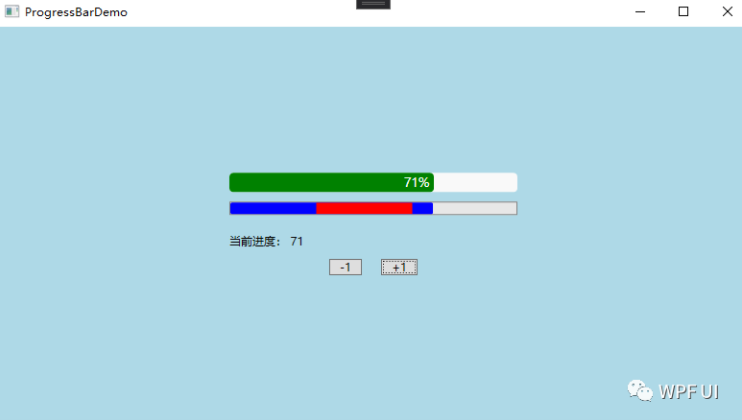
效果图:
© 版权声明
文章版权归作者所有,未经允许请勿转载。
THE END


暂无评论内容