看到一个类,Arc,试一下它的功能喽
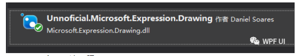
在Nuget上查找下面这个库,引用后便可以使用
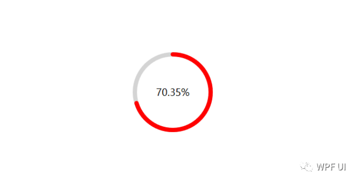
搞一下圆形slider, 看一下效果图:
下面就直接看看代码:创建一个类 CircleProgress :
using System.Windows;
using System.Windows.Controls.Primitives;

namespace WPFDemos
{
    public class CircleProgress:RangeBase
    {
        public double EndAngle
        {
            get { return (double)GetValue(EndAngleProperty); }
            set { SetValue(EndAngleProperty, value); }
        }
        public static readonly DependencyProperty EndAngleProperty =
            DependencyProperty.Register("EndAngle", typeof(double), typeof(CircleProgress), new PropertyMetadata(0.0));

        public double Percent
        {
            get { return (double)GetValue(PercentProperty); }
            set { SetValue(PercentProperty, value); }
        }

        public static readonly DependencyProperty PercentProperty =
            DependencyProperty.Register("Percent", typeof(double), typeof(CircleProgress), new PropertyMetadata(0.0));

        protected override void OnValueChanged(double oldValue, double newValue)
        {
            base.OnValueChanged(oldValue, newValue);
            Percent = Value * 1.0 / Maximum;
            EndAngle = Percent * 360;
        }
    }
}
然后,在App.xaml里面定义它的样式:
<Style TargetType="local:CircleProgress">
<Setter Property="Width" Value="100"/>
<Setter Property="Height" Value="100"/>
<Setter Property="Maximum" Value="100"/>
<Setter Property="Value" Value="0"/>
<Setter Property="Template" >
<Setter.Value>
<ControlTemplate TargetType="local:CircleProgress">
<Grid Width="{TemplateBinding Width}" Height="{TemplateBinding Height}">
<Canvas>
<draw:Arc ArcThicknessUnit="Pixel" EndAngle="0" StartAngle="360"
Width="{TemplateBinding Width}"
Height="{TemplateBinding Height}"
Stretch="None" Stroke="LightGray" StrokeThickness="8"
StrokeEndLineCap="Round"
StrokeStartLineCap="Round"
/>
<draw:Arc ArcThicknessUnit="Pixel" EndAngle="{TemplateBinding EndAngle}" StartAngle="0"
Width="{TemplateBinding Width}"
Height="{TemplateBinding Height}"
Stretch="None" Stroke="Red" StrokeThickness="8"
StrokeEndLineCap="Round"
StrokeStartLineCap="Round"
/>
</Canvas>
<TextBlock Text="{Binding Percent,RelativeSource={RelativeSource AncestorType=local:CircleProgress},StringFormat={}{0:P2}}" FontSize="18" Foreground="Black" HorizontalAlignment="Center" VerticalAlignment="Center"/>
</Grid>
</ControlTemplate>
</Setter.Value>
</Setter>
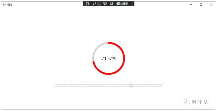
</Style>大功告成,在MainWindow里测试一下:
<Window x:Class="WPFDemos.MainWindow"
        xmlns="http://schemas.microsoft.com/winfx/2006/xaml/presentation"
        xmlns:x="http://schemas.microsoft.com/winfx/2006/xaml"
        xmlns:d="http://schemas.microsoft.com/expression/blend/2008"
        xmlns:mc="http://schemas.openxmlformats.org/markup-compatibility/2006"
        xmlns:local="clr-namespace:WPFDemos"
        mc:Ignorable="d"
        x:Name="widnow"
        WindowStartupLocation="CenterScreen"
        UseLayoutRounding="True"
        Background="LightBlue"
        Title="title" Height="500" Width="1000">
    <Grid Background="White">
        <local:CircleProgress x:Name="cir" Width="150" Height="150"/>
        <Slider Value="{Binding Path=Value,ElementName=cir}" Maximum="100" Width="500"
                VerticalAlignment="Bottom" Margin="0 100"/>
    </Grid>
</Window>
为了方便演示,用一个默认的Slider控件修改它的Value

ok 结束
© 版权声明
文章版权归作者所有,未经允许请勿转载。
THE END


暂无评论内容